Consumer Personalities & Visual Cues in Food Choices – Aesthetics of Product Design
10 May 2026
In today’s competitive food and nutrition market, consumers rarely choose products based on ingredients alone. The visual appearance of a…
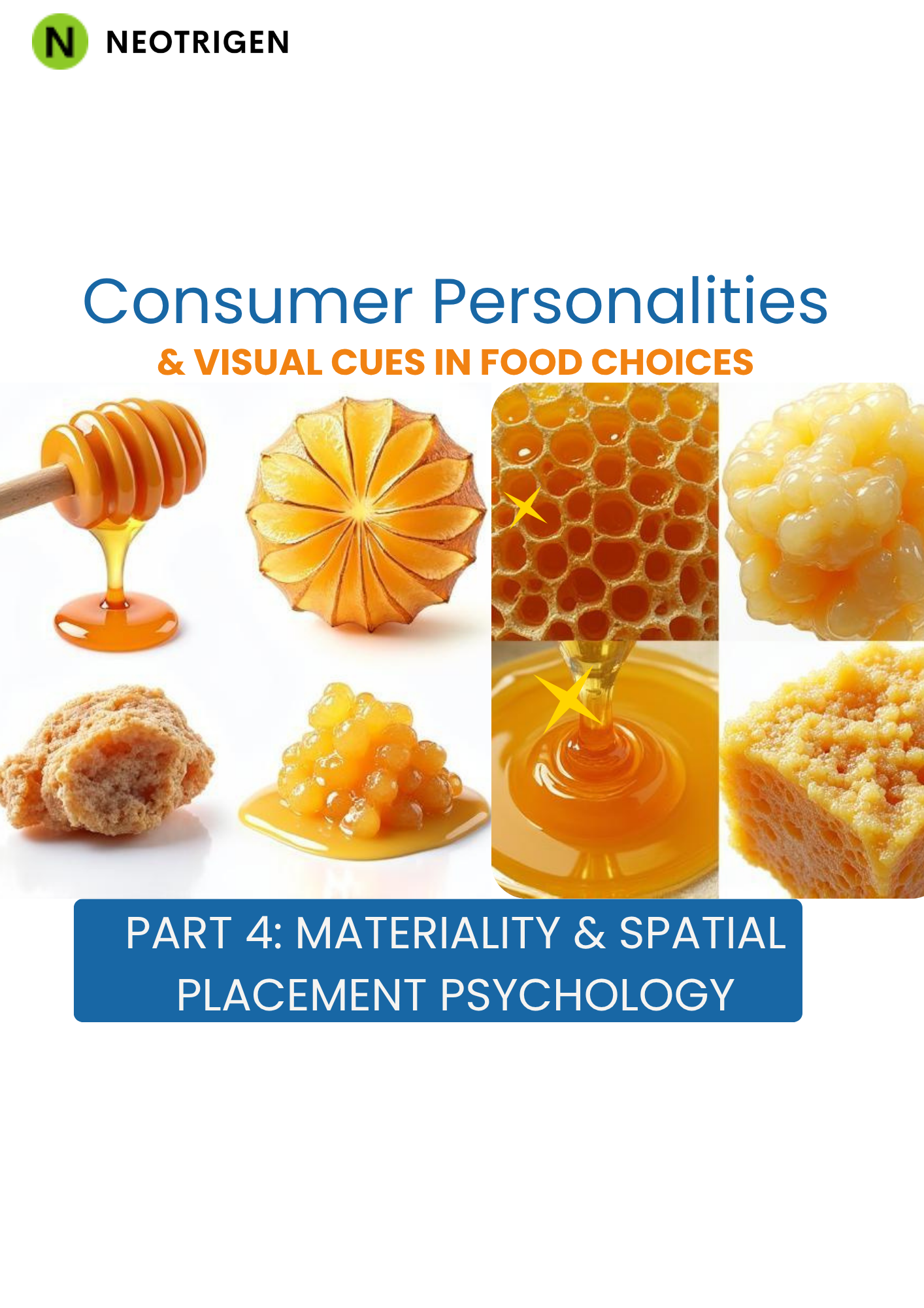
When you walk into a supermarket and reach for a product without really thinking about it, that moment is rarely as spontaneous as it feels. Somewhere between your eyes and your hand, a sequence of perceptual judgments has already taken place — shaped by the way a package feels in your grip, the texture of its surface, where it sat on the shelf, and how your own personality quietly weighted each of those signals. This is the territory that materiality and spatial placement psychology occupy, and it is one of the most underexplored levers in food consumer behavior today.
Understanding how these cues interact with consumer personalities is not merely an academic exercise. For food and beverage businesses, it is the difference between a product that earns a second look and one that gets passed over without a thought.
Materiality refers to the physical properties of packaging — the weight, texture, rigidity, surface finish, and tactile feedback a product delivers the moment someone picks it up or even brushes against it. What is striking is how much meaning consumers assign to these properties before their eyes have processed a single label claim.
A matte paper surface tends to signal naturalness, restraint, and considered craft. A glossy, rigid plastic container signals efficiency, accessibility, and speed. Neither is objectively better. But each speaks a different dialect to different personality types.
Research consistently shows that individuals who score high on conscientiousness — those who tend to be methodical, quality-focused, and deliberate in their choices — are particularly sensitive to material cues that signal care and intentionality. They notice when a jar feels heavier than expected, when a lid has a precise snap, or when the paper wrapping has a subtle texture that suggests it was chosen rather than defaulted to. These details communicate effort, and effort communicates trustworthiness to this consumer group.
For food brands operating in the health and wellness space, this matters enormously. A protein supplement in a cheap, rattling tub is fighting an uphill battle with a conscientious buyer regardless of what the nutritional panel says. The materiality contradicts the message.
On the other end of the spectrum, consumers with higher openness-to-experience or sensation-seeking traits respond differently. For them, an unusual material choice — embossed foil, a tactile matte-to-gloss gradient, packaging with a soft-touch coating — triggers curiosity and perceived novelty. These consumers are more likely to pick up a product specifically because it feels different from what surrounds it.
Food brands targeting adventurous or trend-forward buyers can leverage unconventional materiality as an active recruitment tool, not just a background design decision.
Where a product lives on a shelf or within a display is as communicative as any element of its packaging. Spatial placement psychology examines how position, proximity, and environmental context shape the consumer’s interpretation of what a product is, who it is for, and whether it deserves consideration.
The longstanding retail wisdom that eye-level placement drives sales is correct, but the psychological mechanism behind it is more nuanced than simple visibility. Products at eye level are implicitly perceived as the category’s standard — the reference point against which alternatives are judged. Consumers who are risk-averse or brand-loyal, personality types that tend toward agreeableness and low openness, are most likely to select from this zone because it feels like a socially validated choice.
For challenger brands entering a crowded category, this creates a layered challenge. Eye-level visibility matters, but so does the neighboring context. A premium natural food product placed between two aggressively discounted mainstream options suffers a kind of perceptual contamination — its positioning contradicts its materiality signals and dilutes the personality-brand fit it might otherwise achieve.
There is a well-documented tendency for consumers to associate higher shelf positions with higher quality and premium positioning, and lower positions with budget or value options. This is not universal across cultures, but it is robust in many Western retail environments.
What is less discussed is how personality moderates this effect. Consumers with high neuroticism — those prone to anxiety, overthinking, and a heightened sensitivity to making the wrong choice — are particularly susceptible to using spatial position as a quality heuristic. They are more likely to default to mid-to-upper shelf positioning as a decision shortcut when ingredient lists or brand names feel overwhelming.
Food brands that rely on dense nutritional positioning or complex health claims need to be especially thoughtful here. If the packaging materiality reads as scientific and demanding, but the shelf position reads as budget, the cognitive dissonance can produce avoidance rather than purchase.
Horizontal position within a shelf run affects category belonging. A product at the far left of a row benefits from what researchers call a “primacy effect” — it is seen first and anchors expectations for what follows. A product at the far right can leverage a “recency effect,” sitting closest to where a buyer’s hand naturally arrives as they scan across.
Perhaps the most psychologically loaded spatial variable is adjacency — what a product is placed next to. Consumers use neighboring products as identity mirrors. A health-focused granola bar placed beside a confectionery product creates uncomfortable category ambiguity. The same bar placed beside a cold-pressed juice range benefits from what psychologists call associative priming, appearing more naturally aligned with the health-conscious consumer’s self-image.
For personality types who place high value on identity consistency — and this is especially pronounced in consumers motivated by values-based purchasing, such as those choosing organic or plant-based options — this adjacency effect can be decisive.
Materiality and spatial placement do not operate in isolation. They create a compound perceptual experience that either reinforces or undermines a product’s intended positioning. A thoughtfully textured, matte-surface package communicating artisanal quality loses much of its resonance when placed on a bottom shelf between two private-label economy products. Conversely, a premium placement at eye level cannot compensate for packaging that feels flimsy or communicates carelessness.
The most effective food brands understand these interactions as a system. Consumer personality insights — gathered through rigorous behavioral research rather than demographic assumptions — are the tool that allows this system to be calibrated properly.
When a business understands that its core buyer is high in openness and driven by novelty, it can justify the investment in unusual material finishes and a placement strategy that positions it slightly apart from category norms, encouraging discovery. When it understands its buyer is conscientious and risk-aware, the strategy shifts: tactile reassurance in the material, eye-level placement in a trusted retail environment, and contextual adjacency to other quality-signaling products.
The gap between a food brand that intuitively guesses at these dynamics and one that grounds its decisions in real consumer behavioral data is significant. Taste and nutrition are necessary but rarely sufficient competitive advantages. The psychological experience of encountering a product — touching its packaging, seeing where it sits, reading the spatial context it occupies — is where purchase decisions are quietly won or lost.
Understanding consumer personalities at a research level, not just through demographic proxies, allows food and nutrition businesses to design experiences that speak directly to the internal logic of their buyers. It transforms packaging materiality from an aesthetic choice into a strategic communication tool, and spatial placement from a retail negotiation into a psychological fit exercise.
For food businesses serious about closing the gap between product quality and market performance, Neotrigen offers data-driven consumer insight services designed specifically for the food and nutrition sector. Through behavioral research, video-based consumer studies, and targeted insight methodologies, Neotrigen helps brands move beyond assumption and into the territory where consumer personalities, visual cues, and spatial placement psychology are understood — and actioned — with precision.
Brands & Consumers by Hepzig Dorathy & Sheena Christensen