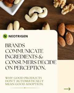
Why Health Focused Food Brands May Struggle Even With “Good” Products
26 January 2026
Brands and Consumers by Sheena Christensen
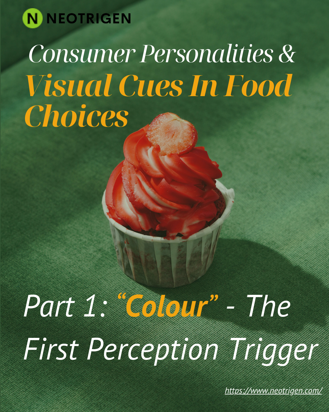
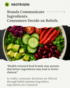
Before a consumer reads a single word on a package, before they check the ingredient list or scan a QR code, they have already formed an impression. That impression is built almost entirely on color. In the food and beverage industry, color is not decoration it is a language. And like any language, different people hear it differently.
Understanding why certain consumers are drawn to certain colors and how those preferences connect to deeper personality patterns is one of the most powerful levers available in food consumer research today. At Neotrigen, a food and beverage consumer insights agency based in Denmark, we work with brands to decode exactly these kinds of signals. What follows is a structured look at how color functions as a visual cue in food choices, and how consumer personality types shape that relationship.
The human brain processes visual information approximately 60,000 times faster than text. When a consumer approaches a supermarket shelf or scrolls through an online grocery platform, color is the very first filter. It triggers associations, signals safety or novelty, and activates emotional responses all before conscious reasoning begins.
This is not accidental from a brand perspective. Behavioral nudging in the food industry relies heavily on color cues precisely because they operate below the threshold of deliberate decision-making. A warm red on a snack pack raises appetite and urgency. A cool green on a functional drink implies calm, health, and trust. Muted earth tones on a plant-based product communicate naturalness and minimal processing. These are not random choices they are the result of decades of food consumer research and applied behavioral science.
The challenge is that not all consumers receive these signals in the same way. Personality plays a decisive role.
Food industry consumer insights consistently reveal that personality structures whether mapped through psychographic segmentation, the Big Five model, or values-based frameworks shape how color cues are interpreted. Here are four broad archetypes that appear repeatedly in consumer data:
This consumer is motivated by wellbeing, longevity, and clean living. They respond strongly to greens, whites, and soft blues colors that signal purity, nature, and transparency. For brands operating in plant-based food or functional nutrition, this archetype is a primary target. Overly saturated or artificial-looking colors create distrust. Muted, natural palettes create credibility.
In food market research across Scandinavian markets, this group has grown substantially over the past five years, driven by rising interest in preventive health and sustainable consumption. For a food and beverage consultant working on product positioning, aligning color strategy with this archetype’s values is not optional it is essential.
Bold colors electric yellows, deep purples, vivid oranges activate this consumer. They seek novelty, stimulation, and identity through their food choices. They are early adopters of new formats, unusual flavor combinations, and internationally inspired products. For food innovation consulting, this archetype represents the leading edge of market trends. Their color preferences signal openness to experimentation and a desire to stand out.
Brands targeting this segment must resist the temptation to “safe” color choices. Bland palettes communicate boredom to the Explorer, and boredom is the fastest path to brand switching.
Warm, familiar tones ambers, creamy whites, soft yellows, and browns resonate with this consumer. They are motivated by familiarity, emotional reassurance, and trust. Heritage brands and comfort food categories have long understood this intuitively. Food industry market analysis shows that this archetype remains the largest by volume in most European markets, including Denmark, and tends to be underserved by brands chasing novelty-driven positioning.
For data-driven food product strategy, the Comfort Seeker archetype provides one of the most stable return-on-investment profiles. Colour consistency across a brand’s range signals reliability, which is the core driver for this group’s repurchase behaviour.
This consumer is suspicious of excess in ingredients, packaging, and visual design alike. They gravitate toward monochromatic palettes, unbleached tones, and sparse design. They read labels carefully and distrust visual complexity as a marker of artificiality. In the premium plant-based food research space, this archetype has become increasingly influential.
Food and beverage consumer insights from Nordic markets suggest that the Conscious Minimalist is growing in both size and purchasing power. For brands, this means that color “less” can actually communicate more provided the product quality and ingredient story can carry the weight.
It is important to note that color cues do not function uniformly across all touchpoints. In-store, color competes with dozens of adjacent products and must create instant differentiation. Online, color must perform at thumbnail scale, often on varied screen calibrations. In advertising, color sets emotional tone before the copy lands.
A rigorous food industry market research approach accounts for all of these contexts. What works at shelf may not work in digital feed placement. What works in print may behave differently under warm retail lighting. Brands that treat color as a single fixed decision rather than a dynamic system leave significant consumer engagement on the table.
Consumer expectations in the food and beverage sector are shifting rapidly. Across markets including Denmark and the broader Nordic region, consumers are more visually literate and more skeptical of color manipulation than at any previous point. They have grown up surrounded by brand design, and many can sense even if they cannot articulate when a color palette feels inauthentic to a product’s actual values.
This is precisely where the intersection of food consumer research and personality science becomes commercially valuable. Brands that understand not just what colors attract attention but who they attract and why are better positioned to build lasting consumer relationships rather than one-time trials.
At Neotrigen, our work in food and beverage consumer insights is grounded in the principle that color strategy without personality insight is incomplete. Color tells consumers what to feel. Personality determines whether they believe it.
Neotrigen is a food and beverage consumer insights agency based in Frederiksberg, Denmark, helping food and beverage brands build data-driven strategies rooted in deep consumer understanding.
Brands and Consumers by Sheena Christensen